Propeak
PROPEAK is an app that allows users to ask any question and get answers from a community of experts for free. Users can also get one in one time with any specific expert should they want to.
Project Overview
Description
PROPEAK is an app that allows users to ask any question and get answers from a community of experts for free. Users can also get one in one time with any specific expert should they want to.
My Role
Duration
11 Weeks
.png)
Understanding the Problem

Problem Statement
Our app users need a way to get reliable information and guidance because they would like to stop feeling insecure about what they hear and read on the internet and about their own decisions.
We will know this to be true when we see how many users rely on the app for advice and guidance in different areas of the day to day life.
Competitor Analysis
The apps Superfy, Mentorcam, Betterhelp, and Wikihow were analyzed. It became clear that many of these apps are new, which was evident in the interfaces and the limited functionality. The market is wide open for this kind of functionality.
The main takeaways from the competitors are the offer of some services for free, the possibility to subscribe and pay a monthly subscription for one on one time with an expert, the clean design, and clear language.
Exploratory interviews
Three people were interviewed about their habits when it comes to finding information, asking for help, and doing research.
INTERVIEW SCRIPT
- What do you do when you just don’t know enough about something that you want or need to know about?
- What is your experience with online forums, have you used any? Were you able to find a solution to your problem?
- What do you think about the misinformation spread on the internet? What steps do you take (if any) to avoid getting false information?
- Have you used an app that lets you ask experts questions? If not, why?
- Which service (app or website) are you used to use for when you are trying to find information?
- Are you a paying subscriber to any app? May I ask which ones?
- What is your process for when you need advice about any subject?
- What would you wanna do if you are not satisfied with the service of an expert?
- What do you think would be the most important features of this app?
- And what would be just nice things to have?
- Would you be interested in having regular conversations or video calls with the same expert? (like a mentor)
- Would you be interested in also helping other people with your expertise?
- What are the most recurring situations where you could use advice from an expert?
INSIGHTS FROM AFFINITY MAPPING
To make sense of the statements made by the interviewees, an affinity map was made.
- They didn’t know of any apps that allowed them to ask a question to a real expert and expressed not trusting online forums due to the unreliability of the information. They rely on reviews to gain trust in a service.
- They imagined an app where they can ask questions and the system recommends the right people to answer it.
- They also expressed the need for an accessible app available in many languages.
- They’d be interested in sharing their language. They would trust an app that they paid for, but they recognize that that would make the service inaccessible for many people.
- They expect quality and functionality for a paid app, and the advice that they would get from an expert needs to be timely, specific, concise, and personalized.
- Participants were interested in finding local advisers, who could offer a “get to know us” appointment with the app, allowing that first interaction and advice to be for free.
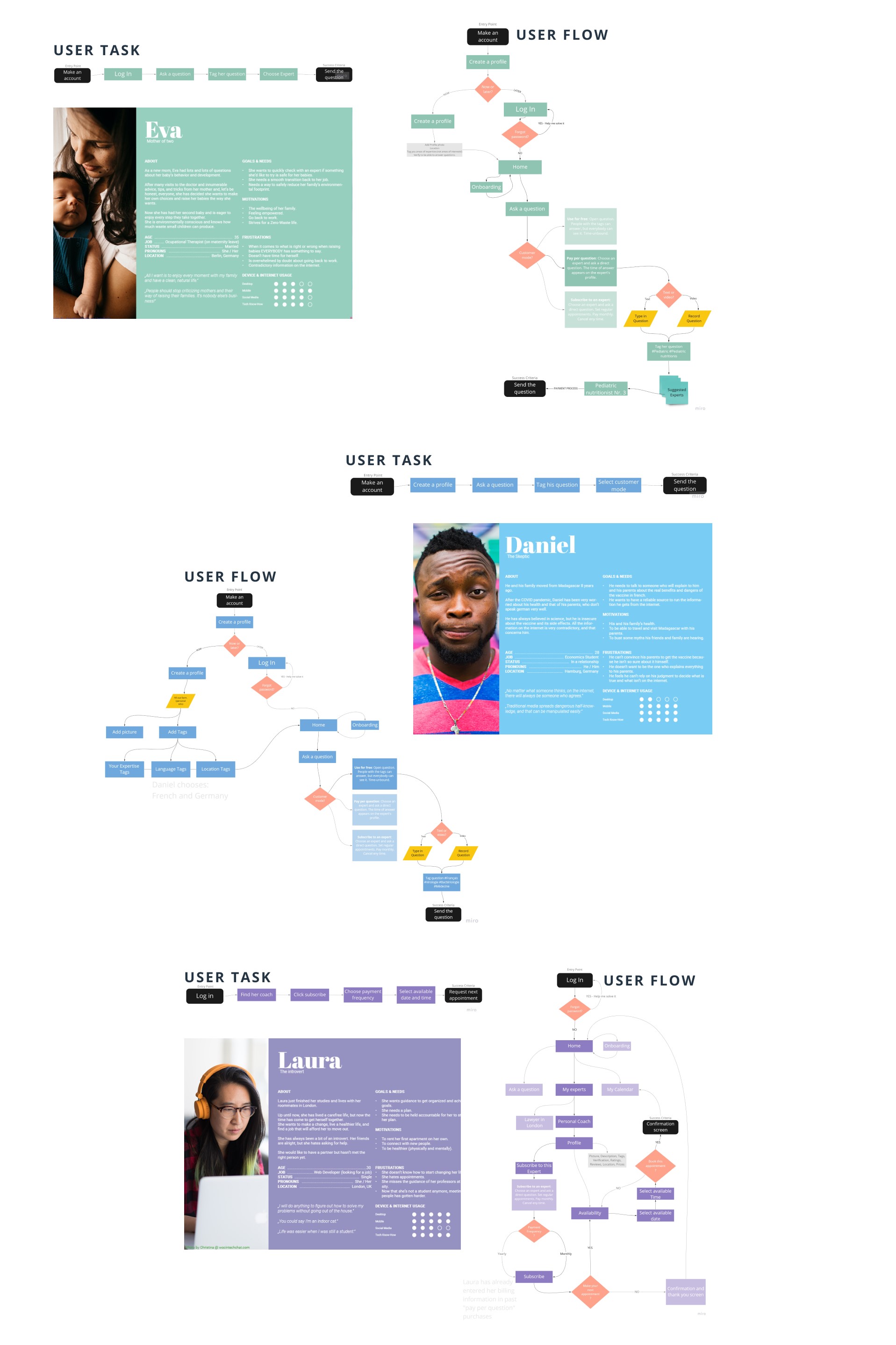
User Personas
With an affinity map, the behaviors and attitudes by the interviewees were synthesized and three user personas were developed.
With help of user journeys, the first specific requirements of the app were pointed out. Combined, they were: Ask a question, Indicate the topics of the question, choose an expert, send the question and follow up with the expert(s).
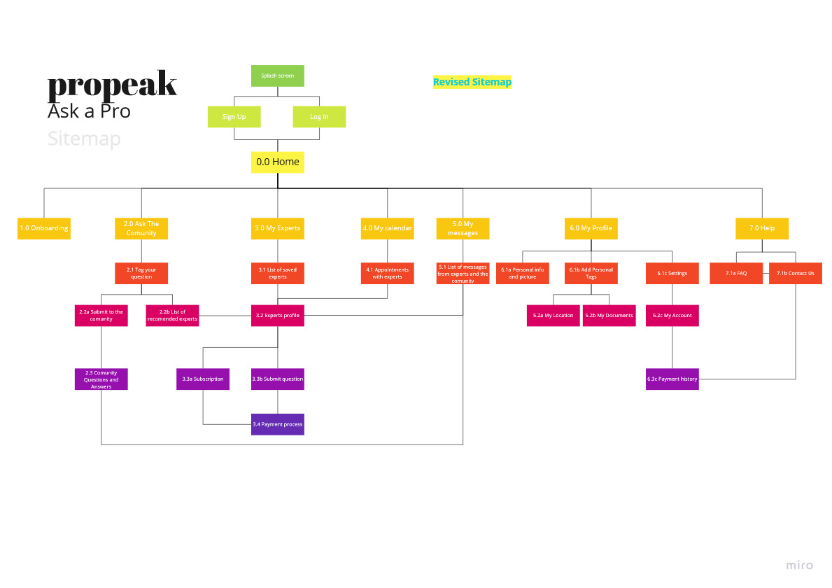
Site Maps
Using the user flows, an initial structure for the app was created. Each category and subcategory was made into a card and a card sorting session was held.
A total of 8 participants completed the exercise remotely and after analyzing their results, the site map was refined.
Paper Wireframes & Prototypes
Following the site map, and with a mobile-first approach, each sceen was wireframed to be able to quickly make decisions and flesh out the main features of the app.
.png)
After making adjustments to the design on the low-fidelity wireframes, the mid-fidelity prototype was made on AdobeXD to prepare it for the first round of usability testing. The following are some examples from the main features.
Usability Testing
BACKGROUND
The propeak app helps users get reliable information directly from experts on any subject. It is designed for adults, young and old, and should encourage them to share their knowledge with others.
GOALS
The main goal for this test round is to determine if any user can access the app, understand the structure and navigate their way through it. We hope to observe and measure its basic functionality, learnability, and main features.
PARTICIPANTS
A total of 6 participants was recruited through my personal network. They fit the demographic and their ages go from 23 to 32 years.
METRICS
Errors were measured using Jakob Nielsen’s scale:
- 0- I don’t agree that this is a usability problem at all.
- 1- Cosmetic problem only; need not be fixed unless extra time is available on the project.
- 2- Minor usability problem; fixing this should be given low priority.
- 3- Major usability problem; important to fix and should be given high priority.
- 4- Usability catastrophe; imperative to fix before the product can be released.
A short satisfaction questionnaire will help users rate their experience after the session.
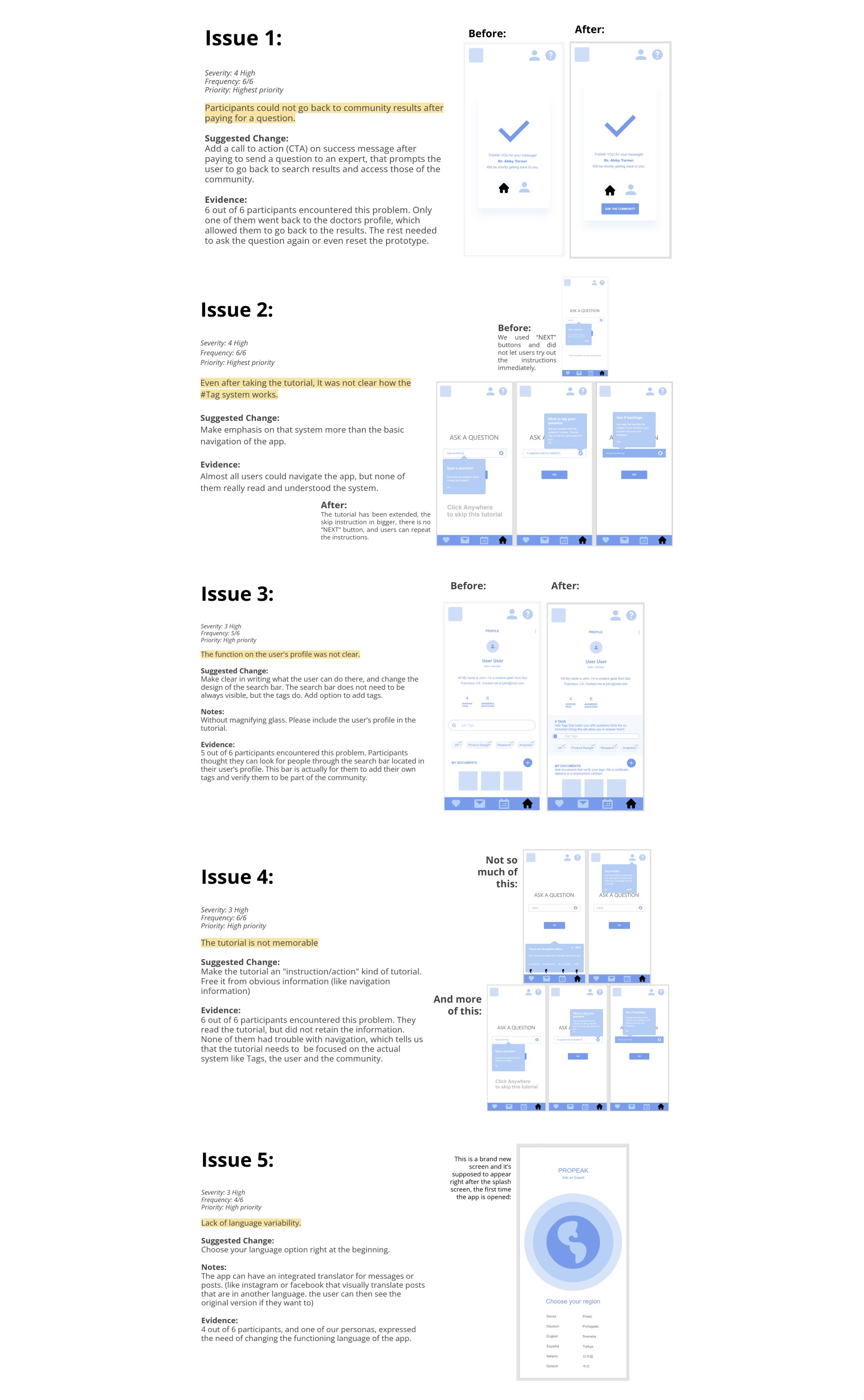
Using affinity mapping, a huge ammount of issues was identified. Using a rainbow chart, the severity and the frequency of the errors could be easily visualized. After this process, a total of 5 frequent issues was identified.
Click here to test this version yourself!
For each issue, the severity, frequency, priority, sugested changes, notes and evidence were recorded.
First Iterations
PREFERENCE TESTING
In the usability Testing we identified that the majority of the participants did not interiorized what was told in the onboarding. The recommended solution was to make the tutorial a step by step process where users immediately try out what the tutorial tells them.
We also identified the lack of a button that allows the user to go back to see the search results from the community after they paid for an expert.
The first UI ideas were implemented and tested with this preference test.
With the use of a preference test, the most appropriate screens were identified. The participants were asked remotely to choose the screen that they could read, and understand better.
Visual elements were tested and participants prefered opaque elements without harsh or colored shadows. The main reason for this was the better visibility. Crisper edges make better contrast.
Polishing the Design
DESIGNING WITH GESTALT PRINCIPLES
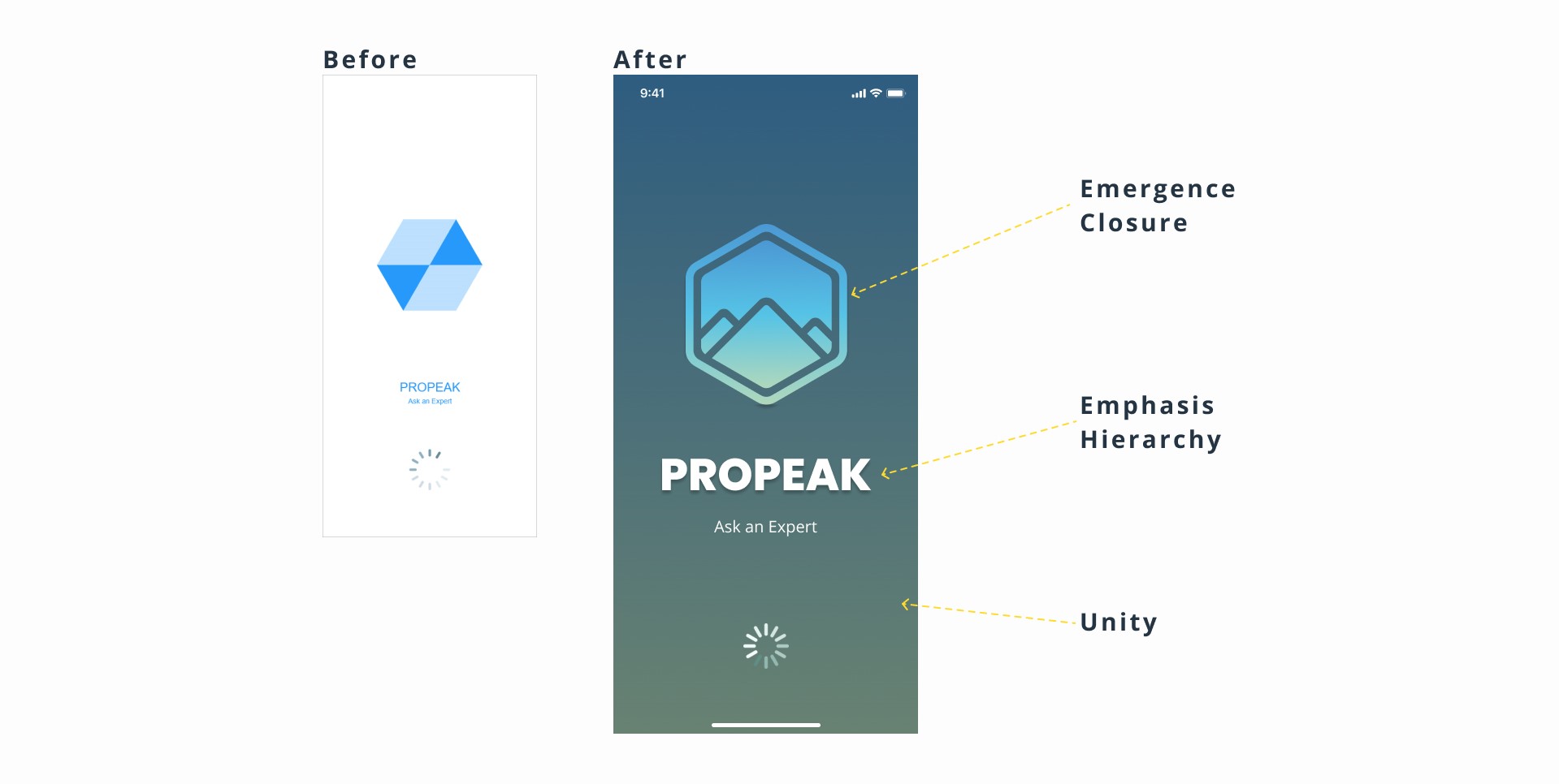
Throughout the app, the gestalt principles were takes into account to ensure a pleasent experience and to adapt the design of the app to the most common patterns of perception. The folowing are some examples of how it was integrated in the design. This high-fidelity prototype was made in Figma
In the logo, we can see the principles of emergence and closure. The shapes are close to each other but don’t touch, creating lines that form a picture.
Following the principle of emphasis and hierarchy, the logo and the name needed contrast. The name was made bigger and the main elements were given a drop-shadow.
The background was darkened to let the name and logo glow. Still, it has a shade of the same color gradient as the logo, which gives it unity.
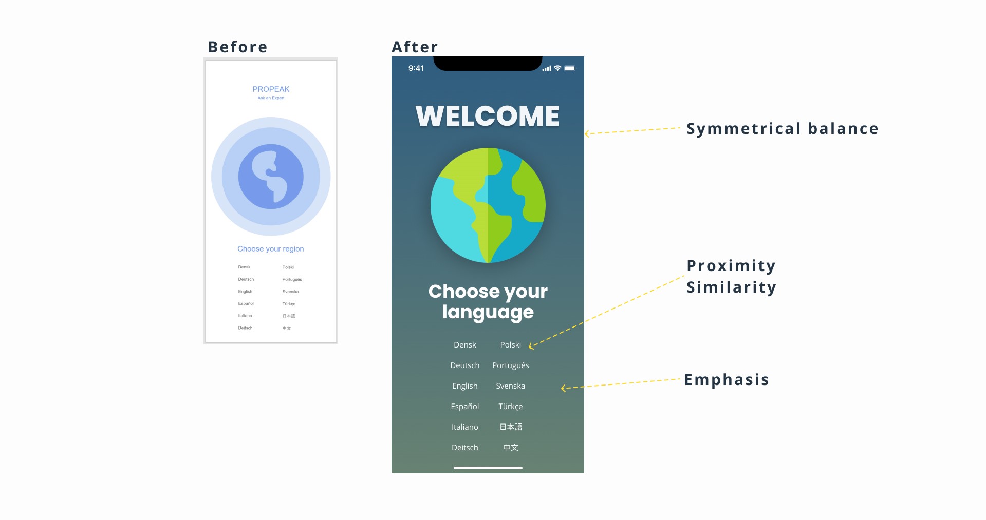
Choose your language
Although the layout is the same, This layout follows the law of symmetrical balance. Big elements are centered and smaller elements are places left and right.
Because of the law of proximity and similarity, the languages appear to belong together and form two clear columns.
The background was darkened to match the splashscreen. It gives the text and images a higher contrast, while being easy on the eyes, improving readability, and emphasizing the information given, rather than the welcome sign.
DESIGN COLLAB
6 other UX designers agreed to give the app a try and to give some useful feedback to improve the design.
Using Notion, the recommendations and errors found were again grated with Jakob Nielsen’s Error Severity Grading Scale.
The updates to the design were then added to a style guide and a design language.
Style Guide